The Five Things Most People Never Think About Until They See the Finished Print
Estimated Reading Time: 7–8 Minutes
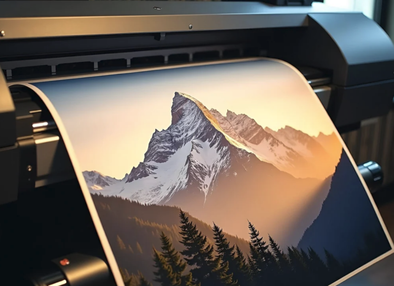
"I thought a printer was just... a printer."
I smiled when a customer said that recently because, honestly, most people think the same thing.
They assume that if two places are printing the exact same photo, the finished prints should look identical.
It makes sense.
After all, if you're printing the same file, how different could the results really be?
The answer is... sometimes dramatically different.
We've had customers bring in prints from online labs or big-box stores and ask if we could "fix" them. The colors looked flat, the shadows had lost detail, or the image simply didn't have the life they remembered.
The interesting part?
The photograph usually wasn't the problem.
It was everything that happened after they clicked "Upload."
Professional printing isn't just about making an image larger. It's about understanding the dozens of little decisions that affect how that image comes to life on paper.
Let's look at the biggest ones.
It Starts Long Before Ink Touches Paper
People often picture printing as one simple step.
Press Print.
Wait.
Done.
In reality, that's only the final step of a much longer process.
Before we ever send a file to the printer, we're already evaluating it.
We're looking at exposure.
Contrast.
Sharpness.
Color.
Resolution.
We're thinking about where the print will hang, how large it's going to be, and what materials will best showcase it.
Those decisions are what separate an average print from one that makes you stop and look twice.
The Paper You Choose Changes Everything
This is probably the biggest surprise for most people.
Paper isn't just paper.
It's part of the artwork.
A bright, glossy finish can make colors appear bold and vibrant.
A soft matte paper creates a quieter, more timeless feel.
Fine art papers add texture and depth that simply can't be replicated on standard photo paper.
We've even had customers choose a completely different paper than they originally planned after seeing sample prints in person.
The image didn't change.
The feeling did.
That's why we always encourage people to see and touch different paper options whenever possible.
Color Isn't as Simple as It Looks
Have you ever noticed that the same photo looks different on your phone than it does on your laptop?
That's because every screen displays color a little differently.
Printers have their own language, too.
Professional print labs spend a great deal of time calibrating equipment so colors remain as accurate and consistent as possible.
It's one of those details most people never think about, but it's one of the biggest reasons professional prints often feel richer and more natural.
Especially when it comes to skin tones.
Anyone can spot a portrait where skin looks too orange or too green.
Good color management prevents those distractions.
Resolution Matters... But Maybe Not the Way You Think
One of the first questions people ask is:
"Is my photo high enough resolution?"
It's an important question.
But resolution isn't simply about having the biggest file.
It's about matching the file to the size you want to print.
A photo that looks incredible as an 8x10 may not have enough detail for a 30x40 wall piece.
On the other hand, many modern smartphones produce files that print beautifully at common sizes.
Every image is different.
That's why we're always happy to take a quick look before you order.
Experience Is Still the Most Valuable Tool We Have
Technology has changed dramatically over the years.
Printers have become faster.
Software has become smarter.
AI has entered the conversation.
But experience still matters.
Sometimes it's recognizing that an image would benefit from a different paper.
Sometimes it's making a subtle adjustment that helps preserve shadow detail.
Sometimes it's simply knowing when to leave a photograph exactly as it is.
Professional printing isn't about changing your work.
It's about helping your work look its very best.
From the Studio
One of our favorite parts of the job is laying two prints side by side.
Same image.
Different papers.
Different finishes.
Almost every time, the customer immediately points to one and says,
"That's the one."
Not because we told them which to choose.
Because once they see the difference with their own eyes, the decision becomes easy.
It's one of those moments that reminds us why samples are so valuable. Sometimes seeing really is believing.
Did You Know?
Many professionally printed photographs are designed to last for decades when displayed and cared for properly.
The longevity of a print depends on several factors, including the type of paper, the inks used, how it's framed, and where it's displayed.
That's one reason we take the time to recommend materials that fit both your image and where it will live.
Common Myth
"The printer is the most important part of the process."
The printer is important, but it's only one piece of the puzzle.
The file, paper, color management, materials, and the experience of the person preparing the print all contribute to the final result.
Quick Tip
If you're deciding between two paper types, ask to see the same image printed on both. Comparing them side by side is often the easiest way to discover which one fits your vision.
Frequently Asked Questions
Does more expensive paper always produce a better print?
Not necessarily. The best paper depends on the photograph, how it will be displayed, and the look you're trying to achieve.
Why do professional prints feel different?
Professional papers are often heavier, more durable, and designed to reproduce color and detail more accurately than standard consumer papers.
Can you help me choose the right paper?
Absolutely. That's one of the most valuable parts of working with a local print studio. We'll explain the differences and help you choose what best fits your image.
Is glossy always the best choice?
No. Glossy, matte, luster, and fine art papers each have advantages depending on the subject and where the print will be displayed.
Should I see paper samples before ordering?
If possible, yes. Holding different papers and comparing them in person makes choosing much easier.
Continue the Series
Next up:
Part 3: The Most Common Printing Mistakes (And How to Avoid Them)
We'll share the printing mistakes we see most often and explain how a few simple decisions can dramatically improve your results.
Still Have Questions?
Every photograph tells a different story, and every printing project deserves individual attention.
If you're unsure which paper, finish, or print size is right for your image, stop by French Broad Imaging. We'll walk through the options together and help you make a choice you'll be happy with for years to come.
About French Broad Imaging
French Broad Imaging is a locally owned print studio in Asheville, North Carolina, specializing in professional photo printing, fine art printing, custom framing, photo restoration, and digitizing services. Every article in our Knowledge Center is inspired by real conversations with customers and years of hands-on experience helping photographers, artists, families, and businesses bring their images to life.
Written by Patrice Kennedy
Owner, French Broad Imaging
For more than two decades, Patrice has helped photographers, artists, families, museums, and businesses preserve, print, and display the images that matter most. His goal is simple: help every customer leave with something they'll be proud to share and enjoy for years to come.
Add comment
Comments